Accessibility in website design is the practice of making your content easier for people who may have some sort of disability.
In essence, optimising your web design to bypass anything that might prove to be a hurdle for easy and effective access to your website for all sorts of people can be summed up as web accessibility.
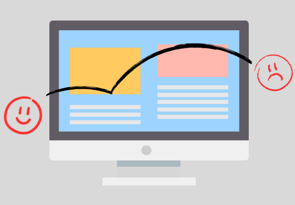
Accessibility is very important in modern website design. And not just for businesses and bigger organisations; any service that wants to reach their audience should make sure their website is accessible.
But before getting into how you can make your website accessible, let us take a look at the audience you’re trying to make your website accessible for.

Accessibility in Website Design
Many innovations in the past decade have revolutionised web design. And while all this technology has increased the functionality of websites and presented more opportunities for website owners to present better content to their users, we mustn’t forget that some of the technical stuff can actually inconvenience some individuals.
This is why accessibility is important. When we talk about people with some sort of disability, we mean those with some sort of physical disability, such as:
- Visual
- Auditory
- Physical
- Neurological
- Cognitive
- Speech
We also refer to temporary disabilities that can be attributed to the environment instead of the individual. Some examples are:
- Mobile Device Users
- Environmental factors, such as light, noise, etc.
- Slow Internet connection or low-end device users
- Layman users
- Older users
- People living in disadvantaged locations
With that out of the way, let us look at ways you can adopt to make your website accessible to as many users as possible.
1. Adding Audio, Text to Speech, and Voice Search
This one targets the first physical disability from our list above. Adding audio, like podcasts or a tool that reads your entire webpage, can help people who have visual impairments.
Similarly, if your website allows users to enter some sort of input or perform some action such as a search, etc., adding speech to text and voice search is really important to make your website more accessible to people. These elements aren’t just making websites more accessible; they prove to be really handy for users when they don’t want to read or scroll through a long list to find something.

Voice search is a cutting-edge web development technology that is likely to become very prominent in the coming years, so getting this latest tool incorporated into your website is a must if you want to keep things up-to-date and stay relevant for a long time.
And while accessibility itself is a modern idea, getting tools that accompany this advanced practice is sure to drive users to your website.
2. Subtitling and Transcription
If you have videos or audios on your website, add their transcription in a downloadable file or link to a separate page.
Anyone who is living with an audial impairment would find it helpful if such notes were added to the visuals. If you’ve got a podcast website, you might as well have the entire thing transcripted right below your audio. You can also attach a separate PDF file.
If you’ve got a video on your website, have an excerpt on the page and add subtitles to the video.
It is a good practice to simply have the entire transcription down on your page too, but in a more attractive way, as if you’re speaking directly to your audience. With a few changes, you can have the same video in article form, providing the same visual and audial experience to all kinds of users.
3. Easy UI to Navigate and Search Through
For users who are at a physical disadvantage, the best you can do is provide a very simple and easy-to-navigate UI. Avoid adding unnecessary effects, and try to keep things in clear view at all times.
Moreover, try to keep your webpage in a well-defined and simplistic sequence so users don’t have to jump through pages to get anywhere. To further improve navigation, rely on menus and breadcrumbs. Avoid adding unnecessary elements that just contribute to the expanded size of your webpage.

Instead of having users go back and forth constantly, have a simpler website structure and don’t dawdle with the search queries. Give the users what they came for up front. Or make it easily accessible for them by highlighting it or displaying it in important places.
Don’t hide stuff for the sake of intricate styling. Nothing attracts users more than a web design that is aimed at helping them.
4. Avoiding Eye-Straining and Shocking Themes
You might have noticed an epilepsy warning in some videos, games, or movies. And this warning is often accompanied by the line “Flashing lights”.
That says enough about how you should cater your website to make it more accessible to users. You should build the theme of your website around relaxing, pastel colours. And while dull colours aren’t always a suitable fit for certain niches, you can still avoid sparkly elements that tug at your eyes.
These bright, shocking colours might appeal to you, but remember that where good website design is concerned, simplicity always wins. So avoid adding elements that either require too much focus or are too shiny and playful.
Similarly, keep your animations cool and don’t go too fast and flashy with them. Elements like this might make your website look unique, but you’ll end up only appealing to a small user base that shares your preferences.
Not to mention, some people cannot stand such flashy themes, so expect them to leave your page very quickly.
5. Keeping Content Simple
Keep your content simple. And we cannot emphasise that enough. Make sure the things you say are written in good English. And that doesn’t necessarily mean Shakespearean English.
Even though it is often tempting to rely on the jargon of your niche and not look for a common word that you’ll need to explain to great lengths in order to get the right idea through, try not to rely heavily on jargon.
Keeping your language simple makes it accessible to not just laymen but also people who are not very well versed in English.
So to make sure your content not only reaches people but is also understood by them, keep your language and content structure simple and easy to digest. This is the best way to get prospects to understand you.
6. Including Visuals and Prompts
Making things easier and faster for users is the major goal of an accessible website design. So instead of relying on text all the time, don’t shy away from including visuals.
It’s true that with visuals, you invite a bit of extra work, and again, visuals can have some flashy undertones that you may want to avoid.
But accompanying visuals with prompts is a good idea. Add both textual and audial prompts to make things accessible for all kinds of users. Prompts make sure the user’s query is answered as quickly as possible.
This is a modern practice. Mostly, we hear that users should spend a lot of time on your page. We consider that a green flag for quality. This is somewhat true. But at the same time, delivering answers quickly and precisely is an even greener flag.
Don’t beat around the bush too long, and test the user’s patience. Give them what they came for with a quick prompt, and let them explore more.
7. Responsive Web Designs
Responsive web designs are a key factor in making websites accessible for mobile device users. Most of your users access your website on their mobile devices. So, of course, you should make sure your website is responsive.

There are many advantages of responsive website designs. A responsive website is optimised to look great on all screen sizes and adapt to new sizes by measuring the dimensions of the device. This is another cutting-edge tool that has become a must for web developers.
Responsive websites are faster on mobiles as compared to non-responsive ones. Their loading time is much shorter, which means users don’t get stuck waiting forever. The interface is also balanced, so the page looks good. For mobile and tablet users, responsive websites are crucial.
8. Dark and Light Modes
Dark mode is the new norm, and almost all big sites have this option. This is because so many of us browse through the Internet at night, and light mode is almost blinding.
Similarly, people who suffer from epilepsy or strokes might prefer the dark mode because colours are numbed down and don’t put too much strain on them.
Luckily, dark mode is good for battery life too, so many people who prefer it for its aesthetic also prefer it for this added benefit.
For those who have trouble sleeping, dark mode is preferable as it doesn’t affect sleep as compared to light mode, which exhibits more blue light. Dark mode is a good tactic to add accessibility in website designs.
9. Optimising Page Speed and Performance
Optimising page speed means you reduce extra elements that aren’t even coming into use for the most part. This makes your website more accessible to people who have a slow Internet connection or are trying to access it from a low-end device.
Making your website as lightweight as possible without losing any of its functionality is how you can help those people access your website easily. One of the key things we’ve mentioned before is simplicity.
This could be the first step you take to optimise your website and improve its performance and loading times.
Keeping your website simple means it is easier and quicker to load because it doesn’t contain too many elements. This increases web accessibility.
10. Helping Users With A Bot
Helping your users is what you want to do the most. So while we’ve already mentioned a few state-of-the-art tools and techniques to do so, here’s another. Use chatbots on your website to guide people and help them get what they want.
Older people who aren’t very tech-savvy and don’t know their way around the Internet will especially find this feature helpful. Chatbots communicate in a natural way. And although their responses are premeditated, their service is still valuable.
You can’t always be there to deal with user queries, but these little assistants will take care of common issues and save a lot of effort and time.
11. Providing Multiple Languages
If your website isn’t meant for only local users, you can add an automatic translation tool to provide translations of your webpage to users that need your service but don’t know your language.
The Internet spreads far and wide, and anyone can access your content. But to help them in the best possible way, you just need to use tools that are made to personalise the web experience. You don’t have to go and do a manual translation.
And while the tools you use might not be 100% accurate, they will still provide some degree of assistance and make your website more accessible for users.
12. Providing Free Demos and Limited Trials
If you’re offering an online service or tool, you can provide free trials to people who aren’t able to financially pay for the whole thing. You can also keep a small version of the tool free for good and reduce its features.
People who only need assistance for a little while will be able to greatly benefit from it, while professionals that can afford it will buy the premium features. This way, you’re helping more and more people access your website and benefit from it.
These free demos don’t hurt you at all. Instead, they help spread your website as more and more people are able to access your services.