If you’re a website owner, you may have heard about the dread of a high bounce rate. Many factors contribute to a high bounce rate, and in most situations, it is indeed something to be dreaded. But that isn’t the case all the time.
Surprisingly, in some cases, a high bounce rate can be good news and actually help your website go up.
But what exactly does the bounce rate on a website mean?
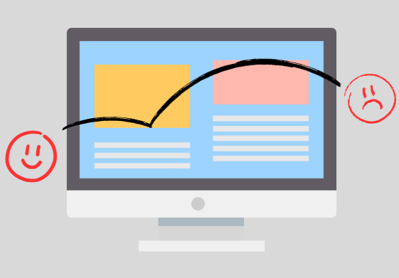
Put simply, bounce rate is a measure of users quitting your website immediately after landing on a page.
Sometimes, it can be hard to figure out what you could be doing wrong with this user behaviour. Fortunately, there are ways to figure this out and reduce the harmful bounce rate on your website.
Before driving into the possible reasons your website could be experiencing a high bounce rate, let us take a look at the meaning of it once more.
What is Bounce Rate? How is it Calculated?
More formally, bounce rate is a measure used by search engines to evaluate the quality of experience a website is offering its users.
It is calculated by dividing the number of single-page visits by the total number of visits to your website. Since single-page visits are usually by users that weren’t impressed or didn’t find what they were looking for, it is a good measure to go with.
When users visit a website and immediately hop out for some reason, it contributes to a high bounce rate.
Generally, a high bounce rate is an indication that the website does not offer a good user experience or is unsafe in some cases.
Naturally, search engines don’t push these websites to the top.
That said, some websites are meant to have a high bounce rate. In these cases, bounce rate is a positive measure, and the higher it is, the better.
These websites don’t suffer at the hands of search engines either, so there is nothing to worry about.
What is the Average Bounce Rate?
Bounce rate is normal to have. Don’t expect everyone to want to stick around your website. No matter how good your website is, some factors will always lead to bounces (for example, misclicks).
There’s no solid number that can be given to mark the average bounce rate. However, 50% is a good assumption to go with, drawing from multiple reports.
That said, depending on the genre and kind of website, it isn’t surprising to see a bounce rate as high as 90%.
This is usually true for blog sites.
The more competition you have in a certain industry, the higher the average bounce rate will be.
That’s not a hard-and-fast rule, however, as e-commerce sites are known to have low bounce rates.
Whatever your bounce rate is, what matters are the steps you take to reduce it.
As for what causes a high bounce rate, here are some possible reasons and their solutions:
What Causes High Bounce Rates?
1. Bad Web Design
Your website may have the best content to offer, but if it can’t convey it effectively, that content is of no use to you.
Websites that don’t follow UX principles often suffer from bad web design. By that, we don’t mean a website has to look pretty. That is not a defining feature to improve web design.
In modern web design, ease of use, understandability, functionality, and efficiency are what contribute to a well-balanced, captivating web design.
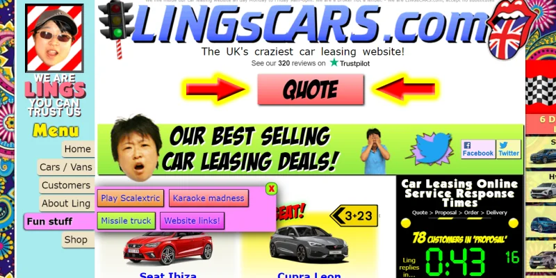
Users shouldn’t have to struggle to find things on your websites. A good navigation system and a clean interface can solve that problem.
You can come up with some very interactive and innovative looks for your website, but don’t forget that simplicity is the king at the end of the day. To reach the maximum number of people, you should try to avoid creating too niche-specific a design.
By making your web design accessible and having all the necessary functions in clear view and easily approachable, you can improve your web design.
Bad web designs leave a bad taste for first-time visitors. If your interface is too confusing or overwhelming, nothing is stopping the users from hopping out and going to another website that extends a hand.
2. Broken Pages
One of the most common causes of high bounce rates is broken pages across your website. Broken pages are pages that give an error and cannot be served.
If users can’t even get to your content, why wouldn’t they leave immediately?
That’s why finding these broken pages and fixing them should be your first priority.
Luckily, identifying these pages across your website, no matter the size, isn’t too hard.
Google Search Console is all you need to find broken pages. Among the many things it lets you monitor, you can see the URLs with a broken page in its Page Indexing report.
Google Search Console is free and a great help for website owners, as it helps you monitor and analyse your pages for any issues. It also lets you see how your website is performing and what your best pages are.
If you’re looking to fix a high bounce rate, it is one of the biggest helpers out there.
3. Mobile Usability Issues
Is your website responsive?
Responsiveness is crucial for modern websites, as mobile users exceed desktop users. If you aren’t offering a good mobile experience, you are likely to see a high bounce rate.
With about 55% of users on mobile devices, you are missing out on a massive chunk of the audience if your website isn’t responsive.
In fact, responsiveness and a good mobile experience are ranking factors used by search engines. So make sure your website renders properly on devices of all sizes.
To check whether you have issues with responsiveness, you can take a look at the Google Search Console’s Page Experience and Core Web Vitals reports.
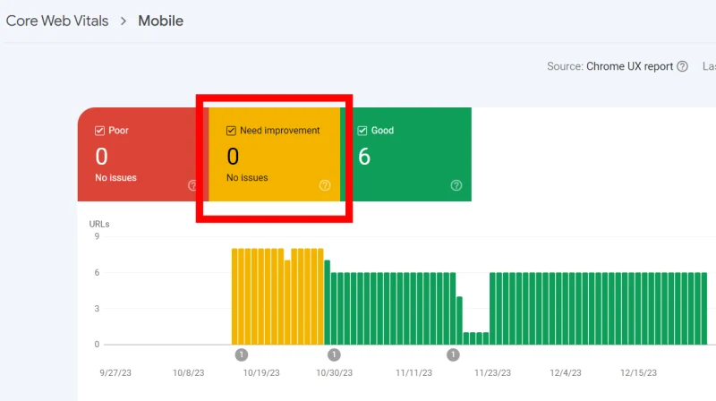
Keep in mind that if you don’t have enough data for mobile users, you won’t be seeing this report.
If your website is new or if you are taking proactive measures against bounce rates, then using cross-browser emulators might be more beneficial. Tools such as Google Resizer, Emulator, or BrowserStack can be used for this purpose.
You can also do it simply with your browser.
If you’re using Google Chrome, open the page or website you want to check and right-click to see Inspect.
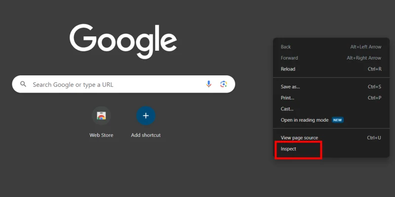
Toggle the device toolbar to choose different devices and sizes and see how your website looks.

Most browsers have a similar option. Opera GX has an Inspect Element feature that works the same way. Edge has Inspect too.
4. Page Speed
How long it takes users to access the content on your website can be a deciding factor for bounce rate. If pages take too long to load, users are likely to jump back and go to another website.
Speaking of page speed, differentiating between interactive content and non-interactive content is important. For instance, if you have a form, any downloadable content, a tool, etc. on your website, you’d expect that’s what the users came to the page for.
If these interactive elements take too long to load, users are likely to quit, even if it seems like the rest of your page didn’t take that long to load.
Page speed is a long subject to explore, and there are many reasons your website is taking too long to load.
Also note that websites load slower on mobile devices as compared to desktop devices. So if you’re looking at your computer and think the website isn’t that slow, try opening it on your mobile as well.
To get started with page speed, you can once again head over to Google Search Console and look at the Core Web Vitals, both for desktop and mobile.
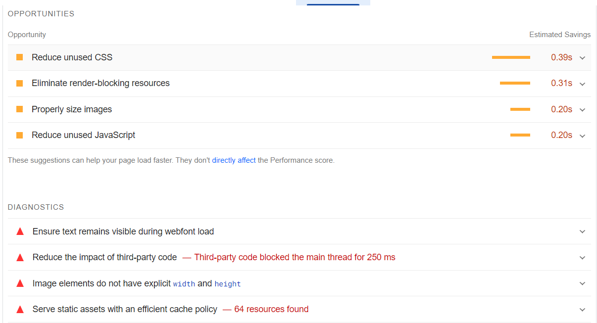
For a more detailed report, Page Speed Insights is an excellent tool. You can check out Lighthouse, which is essentially the mobile version of Page Speed Insights.
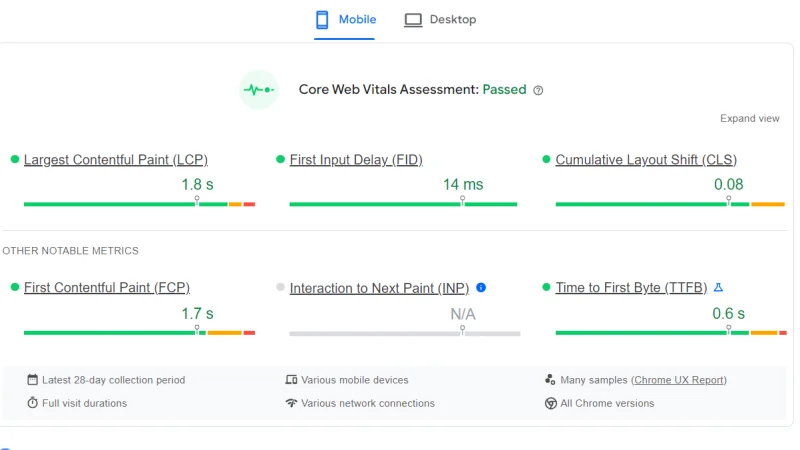
These tools suggest ways to reduce the extras on your webpage that could be causing a delay in fully loading your page. They help you find places where you can cut the extra load and make your website lightweight so that it can load faster.
5. External Links on Your Website
You might have some external links placed on your website.
This is important in case you are an affiliate and users can access other websites directly through your website, simply by clicking on a product or a card.
Similarly, maybe you have an ad running on your website that takes users to some other website.
In this case, a high bounce rate would suggest that your users are visiting those external websites via your website.
Is that good?
It’s great!
Since that’s exactly what you want your users to be doing. That said, just because you are an affiliate site doesn’t mean every bounce is a good bounce.
So how can you tell where the users are going?
You can implement snippets and see where your users are clicking and heading off to through Google Analytics.

Analytics lets you keep track of user activity across your website. If you notice a lot of clicks on the product, that’s a great sign and a good bounce rate.
Google Analytics lets you look at a lot of other things, like sessions, engagement time, where your users are coming from, and ultimately, if they’re going to other websites through the links placed on your website.
All this data can help you gauge if users are interacting effectively with your website and whether your bounce rate is good.
6. Too Many Ads
So you’ve nailed the web design and made sure you don’t have any issues on live pages, but the bounce rate doesn’t seem to be going anywhere. Moreover, you don’t seem to have any engagement, which means users are hopping out of your website because they see something they don’t like.
If you’re serving ads on your website, that could be one reason you’re seeing a high bounce rate.
For starters, make sure there aren’t too many ads on a single page. It not only gives an unprofessional look to your website but also annoys users.
Secondly, make sure the ads are well-placed and don’t get in the way of content and distract users so much that it becomes hard to discern what is content and what is an ad.
Third, don’t bombard your users with popups.
There was once a time when webmasters had the idea that shoving a piece of unrelated product in a user’s face would surely convince them to click and buy.
If you’re fishing for accidental clicks, that may have worked, but if the first thing users see when they land on your website is an ad and not an answer to their query, they are likely not coming back to your website for a while.
Try to avoid raining ads down on unsuspecting users.
7. The First Thing Users See
The first thing you present to your users can be a defining factor that determines whether they’ll stick around or go back.
Depending on the kind of website and strategy you have going for it, it can be various things.
For example, a blogging website will likely present the content straight up. It’d be awkward if users had to login to read a blog.
Similarly, if it’s an online service, many of us would prefer to get right into it. Something like a landing page might not be the best choice in all cases. And while authentication might work for some websites, it won’t work for all of them.
Websites that require the highest level of security shouldn’t compromise on that sort of thing, though. On such websites, where users have to enter sensitive information, they likely don’t trust the website right away. Some degree of buildup is crucial to establishing credibility.
On that note, if you’ve got a popup waiting to show up, make sure it isn’t the first thing users have to bear with. Place it near the top of your page, but not at the absolute beginning.
That said, if users expected an answer and got it the minute they got to your website, it isn’t rare for them to leave right away. This may look like they bounced back, but this too is a good bounce.
It can be tricky to convince users to stay and read on. Regardless of whether you achieve that or not, being direct with your answers isn’t bad at all.
In fact, search engines like websites that aren’t dawdling and wasting a user’s time. If something can be said in one line, it should be said so. An explanation can follow, but users shouldn’t have to read a 1000+ word article to get a yes or no answer.
8. Clickbaiting and False Meta Description or Tags
Clickbaiting is the worst thing you can do to users. If you think having meta that catches users can help even with unrelated content on the page, you are very wrong.
Think of it as lying to users. That’s not something that’ll do you much good in the long run, so don’t try to trick your users.
You’re only destroying a user’s expectations by clickbaiting them, and that is likely to end up in a huge bounce rate that will undoubtedly come back to bite you in the rear.
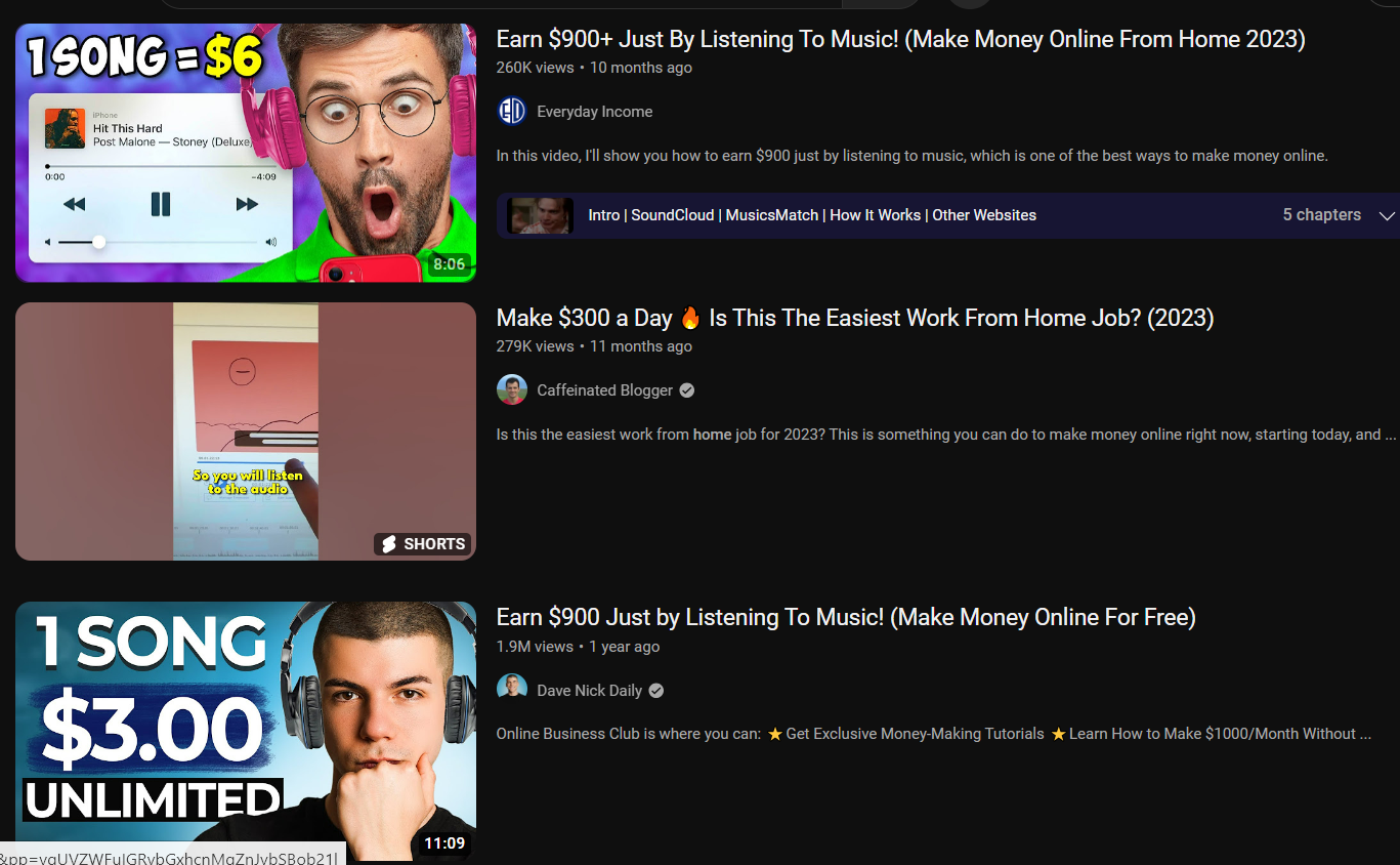
Clickbaiting can be in the form of presenting completely unrelated content, or you might be trying to manipulate the intent of your meta.
In the latter case, it might not even be intentional.
For instance, if you own a company that fixes and sells used cars, you might have an online portal where you list all the cars that are up for sale. On your website, you’ll also be listing all the fixing services that you are offering.
That’s well and good. If the meta description of your website says that users can buy cars, that works perfectly.
The other case is that you don’t have any portal for users to directly make a sale or check out the cars that are currently available. In this case, your website is essentially a portfolio website that represents your business, but it isn’t a place where users can make any transactions.
In such a case, having a meta that says “Buy cars” or something that explicitly invites users to a transaction of some sort is borderline clickbaiting.
The end goal might be the same, but considering intent on websites is a different matter, and if you want users to stick around, you shouldn’t lead them on with false metas.
9. Useless Content
If you’ve got all the other areas covered, maybe it’s time to swallow the hard pill and accept that your content may not be that good.
Maybe you aren’t targeting the right areas and have content that doesn’t answer the queries. Maybe your take on a topic is just not that stellar. Maybe the way you present your content feels too heavy or wrong in some other way.
So on and so on.
When it comes to content, there’s too much that can go wrong, and users simply have no reason to stick around.
Try polishing your content by targeting the right intent. Achieving a balance can be hard, but try to stay in the middle.
Don’t start off your content with something so incomprehensible or too high-level that laymen get scared right off the bat and leave immediately. On that note, don’t start on such a basic level that people get bored and end up learning nothing useful.
You should be fluid and switch tones once in a while to keep the attention of your readers.
That said, sometimes it isn’t the content itself that’s the problem, but the way it is presented.

Huge logs of paragraphs should be avoided at all costs. If it isn’t possible, include a TLDR or use headings that are concise and save the user’s time where they can.
Unless your website is an encyclopaedia, users likely aren’t going to dive into too-long and stuffy content.
Use images and have some air space to make your content a bit more breathable. Make sure the font isn’t too small and is easily readable. Avoid colours that can scare away users simply by existing so intensely.
10. Unsecured Website
Users are likely to bounce out of your website if it isn’t secure. That’s to be expected, and in fact, it is good user behaviour.
Every website should seek to protect its users from harmful content. Security is a huge concern for websites that require users to provide any sensitive information, such as login information, bank details, or other credentials.
To protect user data and warn users from harmful websites, browsers usually prompt the user about the safety of their connection.
You might have seen the “Not Secure” or “Dangerous” warnings next to the URL of a website. Different browsers have different labels for prompting users.
These warnings can lead to users quitting websites that aren’t deemed fully secure by browsers.
The solution to that is clear. You must tighten security and make sure your website has no issues that can put users in doubt.
First, make sure you have a valid SSL certificate installed. This way, you can ensure HTTPS instead of HTTP. HTTPS means data is encrypted during transmission, making it safer.
Even if you don’t ask users for any data, you can be deemed “Not Secure” by browsers simply by having an HTTP connection. For naive users, it can be misleading and may lead to a high bounce rate.
Depending on the degree of data you need from users, you’ll need to invest in cybersecurity services to make sure no compromises are made.
Conclusion
No matter what you’re doing, don’t expect the bounce rate to completely disappear. That said, it is a good practice to keep improving your content to keep it up-to-date.
For starters, you should try going through your website and looking for possible issues that could be contributing to a high bounce rate. Once you’ve resolved these issues, wait for results to show.
It is important to consider things from the user’s point of view if you really want to evaluate your website. If you can’t see what could be the problem, get someone to review it for you.
Look at the data and determine user behaviour to establish if the bounce rate is good or bad.

