90s websites are no doubt one of the most iconic phases of the Internet. In a time when the field of UX hadn’t yet bloomed, web builders focused solely on being unique. This uniqueness, in many cases, was, well, let’s say, quite eccentric.
And though, at the time, this unique take on website design was considered well acceptable, will these designs still fly for modern websites?
Surprisingly, the answer is yes. Some of the latest website design trends are heavily influenced by the classic 90s websites. In fact, 90s design is a whole category of website design that many people love to mould into something new.
But that’s not the end of it. Some of the old websites from way back in the 90s and early 2000s still exist to this day. And while, in most cases, they are simply a relic of the good old days, many of these websites are fully functional.
We take a look at some websites that have been around since the 90s and still look the same.
1. Space Jam
Space Jam is a live-action/animated movie made in 1996. We’re all likely to have seen it at some point in our childhood. And though many of us may not remember much of it, the movie had its own website.
Space Jam is a sports movie about Looney Tunes trying to win a basketball match against invading aliens. And if this premise sounds wacky to you, you better believe the movie is no different. It stars the GOAT, Michael Jordan, as himself.
The movie had a lot of spin-offs and sequels. If it’s your cup of tea, you might want to look into it.
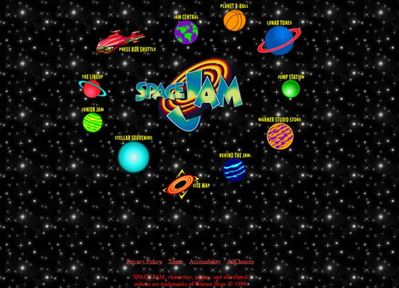
Space Jam’s website is the epitome of 90s web design. It does justice to the movie and has managed to stick around for two decades now.
You can visit the website for a very 90s walkthrough of the film, from production notes to behind-the-scenes pictures. The website is keeping the legacy alive. It also has quizzes and other games for fans. You can also get the story of the basketball players that starred in the movies.
2. Craigslist
Craigslist is a well-known website for selling and buying stuff. You can find pretty much everything there is to buy.
Craigslist isn’t an e-commerce platform where you build a store. It is a listing website where users can sell their products to locals. From jobs to houses and many other services, you can find pretty much everything on Craigslist.
The website currently operates in 70 countries. It is one of the most successful advertising websites on the Internet.
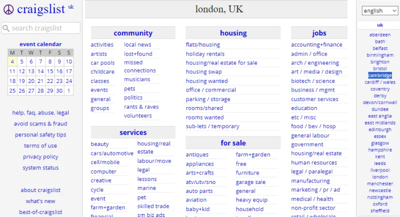
But when it comes to design, Craigslist hasn’t tried to be very flashy. It has a very simple design, and this is the design it has stuck to since its beginning in 1995.
Being such a huge reserve of data, Craigslist has focused on improving ease of use instead of visual appeal.
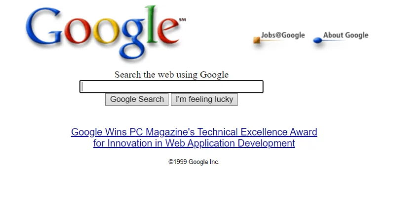
3. Google
Google needs no introduction. The search engine doesn’t seem to have changed much since its beginning in 1998.
Google is the most used website in the world. And there’s a good reason for that. It is the go-to search engine for the majority of the world.
The reason Google hasn’t changed is perhaps because there’s nothing to change. It is quite an optimised service. We don’t expect much of a change, even in the future.
When it comes to search engines, design changes are very rare. That’s because these websites are meant to be very simple and straightforward. Their purpose is to assist the users as quickly and efficiently as they can.
And Google does a great job of that. With a very simple and easy-to-understand interface, we don’t think there’s any room for change. At this point, most of us have come to love the familiar look of Google, and it’d be sad to let it go for a sparkly design.
4. Ling's Cars
Ling’s Cars, with its eccentric design, is a prime example of 90s web design. The website is still alive, exactly as it was.
Known for its peculiar design, Ling’s Cars has been called the weirdest website on the Internet.
With a plethora of unrelated things on the website, it makes for a good time if you’ve got an hour or two to kill.
Ling started the website for her car-leasing business in the UK, which she founded in the 90s. The website hasn’t changed since then. As stated by the owner, she wanted the website to be different. Judging from the reputation the website has garnered, she seemed to have done a good job at being unique.
The website has games such as Scalextric, karaoke, and Ling’s interviews that show off her quirky and witty personality. All in all, the website is a good dive. And the design only adds to the appeal.
5. World Wide Web
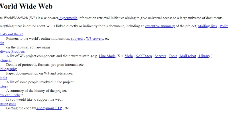
The World Wide Web is the first website to exist. And luckily, it is still up and running. But what makes it better is that it hasn’t changed at all since the day it was launched.
The Internet fossil is well preserved and stands to mark the beginning of the Internet. Tim Burners-Lee created the website in 1990.
At the time, it served to guide people across the Internet. Back then, Tim was working at CERN, and he found sharing and updating data and information quite inconvenient. To resolve this difficulty and facilitate the exchange of information among researchers, Tim put together what we now know as the web.
The website contained information about the World Wide Web project itself, and you can still read it.
Of course, the information hasn’t been updated, so it still exists in its most original form. Being so well preserved, it is the most original web design in the world.
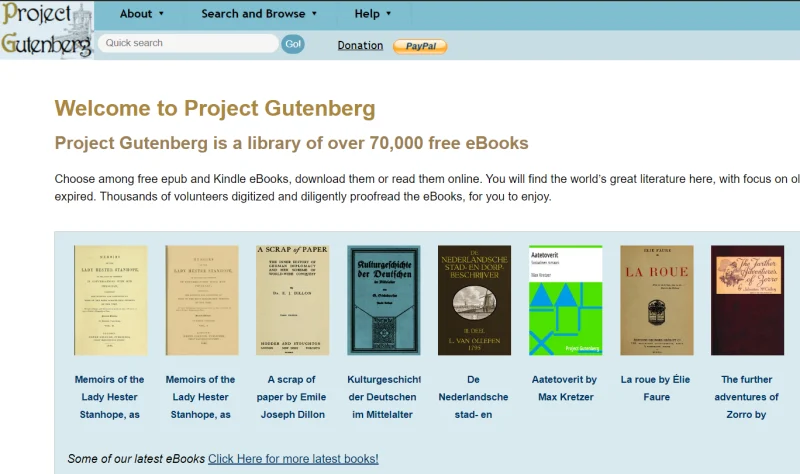
6. Project Gutenberg
Project Gutenberg is an online library, the oldest of its kind. With over 70,000 ebooks and 5000 audio books available in a number of languages, Project Gutenberg is the go-to website for many readers even today.
The website started to preserve books online and make them accessible to people all around the world.
The web design is very simple. Project Gutenberg has books available in many formats, including PDF, EPUB, and HTML. Some of the books are scanned copies, while others are available in HTML.
At times, the website has come under scrutiny for using an outdated format, but with such a vast number of books, it isn’t likely that the website will revamp the entire archive.
The design is reminiscent of the 90s simply because it hasn’t been updated.
Since, in the beginning, books had to be uploaded manually, it must be quite tedious to update each and every book that rests in the archive. The result is a very resourceful and simple-looking relic of the Internet that is one of the most useful websites on the Internet.
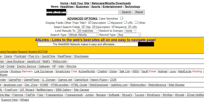
7. ALIWeb
The world’s oldest search engine is still around. Martijn Koster created ALIWeb in 1993. ALIWeb stands for “Archie-Like Indexing for the Web”.
The search engine is a unique one when it comes to design. Other search engines that are around look very different from ALIWeb.
The website lists categories such as computing, entertainment research, etc. Every category has subcategories and links leading to different web pages.
By no means a conventional search engine as we know them, ALIWeb has a lot of options to perform an advanced search, such as case-sensitivity, options for keywords, URLs, and many more.
Users could submit their websites for indexing on ALIWeb. As it happens, not a lot of websites were submitted, which led to very little use of ALIWeb. The website is currently defunct.
Although you can find the website on the Internet with the exact design, Koster is not associated with it. The design is the same as the original website, if that’s something you’d be interested in checking out.
8. Milk.com
Milk.com is an awesome website to check out if you’ve got some extra time on your hands. The website started in 1994, and since then, it has barely changed. With a very simplistic, minimal design, the website has some interesting things to say.
Dan Bornstein, known as Danfuzz for mysterious reasons, is a web developer and the creator of Milk.com. The website is filled with his quirkiness. (We had a good hour-long laugh while researching it. Thanks, Dan!) Just like Ling’s Cars, Milk.com has a lot to say about the creator.
Counterintuitively, Dan has nothing to do with the dairy industry. And he’s very clear about it. Even though the name may throw you off, just like it does for many others who email him regarding milk problems, Dan explicitly confirms that he has no connection with any milk production.
For instance, Dan has some very interesting answers to frequently asked questions.

From some witty letters and stories to Dan’s replies to emailers, the website is filled with interesting material to explore.
The design is as 90s as it gets. It doesn’t seem to have undergone any changes since its launch. But there’s plenty of material to keep you hooked for an hour or two.
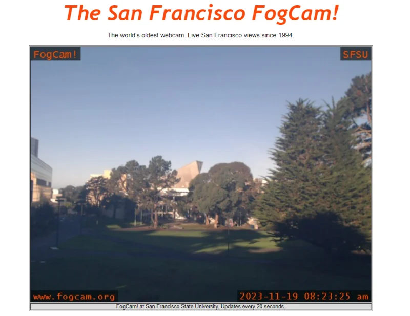
9. San Francisco FogCam!
The San Francisco FogCam! is the oldest webcam in the world. The website came out in 1994 and has changed very little since then. In fact, there’s barely any difference.
The website is still functional. It updates the pictures it takes every 20 seconds. The University of San Francisco is the one behind its creation. Although it isn’t something you’re likely to look at for a long time, every once in a while, you can find a bunch of interesting pictures.
Created by Jeff Schwartz, also known as Webdog, and Dan Wong, also called Danno, the FogCam! is another Internet relic that is loved by many.
The website is practically just a simple page, so there haven’t been any changes in the design.
More than a design, the website reflects the ideas of the 90s that have made it into the modern world.
10. CNN’s OJ Simpson Trial Page (1996)
OJ Simpson’s trial is one of the most documented trials of all time. That it has a website of its own isn’t surprising. CNN’s OJ Simpson Trial Page has everything you’d need to know about the trial.
To top that off, it is a very 90s-looking page. We can’t guess as to why it’s been kept so simple and primitive, even though CNN has a decently modern web design.
In any case, the trial page offers insight into everything from suspect to victim and from arrest to sentence. You can also find related stories on the page and learn about the aftermath of the trial and how the news media has been keeping up with the case.
With a minimal design, the trial page has links to further readings that are just as simple as the trial page itself.
We like to think this simplicity is deliberate, but in any case, it constitutes an interesting 90s website design that is still available for people to navigate and learn about the case.

Takeaway
If you’re willing to look around, you might come across many more interesting websites that reflect 90s website design. Even if some of the websites weren’t made in the 90s, with the wave of new ideas, there has been a surge in 90s website designs.
Designers are breaking UI norms and letting creativity come into play. This is the same line of thinking as it was back in the 90s when you sat down to create a website. With new ideas and unique thinkers, we’re likely to see some exciting changes and revolutions in the website design industry even in the future.
As such, 90s website design, being as iconic as it is, isn’t going anywhere.

