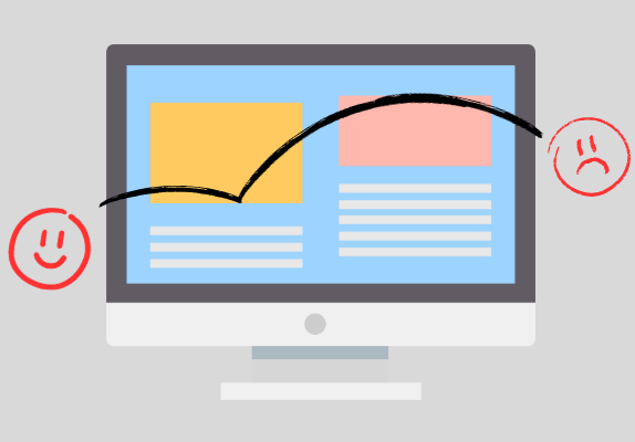
When we talk about website design, we aren’t just referring to how easy it is on the eyes. A good website is also easy to use. In short, what matters the most is the UX. Of course, everyone wants to create a website that users like looking at. You want your prospective followers to stay on your page once they click on it.
If the first thing users see when they visit your page is a mountain of text with links embedded all over the place, it’s only natural they’ll bounce back right away. Hard to trust such spammy looking content, isn’t it?
Similarly, maybe you have the brightest, eye-piercing colours as a theme that essentially render a visitor blinded for a moment, that’s a big no no.
Bad design is considered one of the many signals of an unreliable website, so by all means, you need to avoid that.
Before we go any further, let’s take a look at what website design means for us.

What Makes Up a Good Website Design?
Where website design is concerned, there are many options to go for. You could be talking about the entire orientation of your webpage, or maybe you’re addressing the elements that go on it. Either way, your focus is likely the appearance of your website.
You may have certain ideas regarding the design. Perhaps you want it to be synonymous with your brand’s theme, or maybe there are certain trademark elements that you want to incorporate into your website. It can get confusing what to go for and where to put it all. That’s the whole point of a professional website design.
As a general advice, determine which elements you absolutely want your customers to see when they visit your website. Those elements are something very closely associated with your brand and you want them to be memorable so your customers would immediately recognize them.
Next up, you’ll need to find out where to incorporate those elements. Stuffing them is no solution. One or two places where users can’t miss it is the way to go. For example, logos go on the header.
10 Ways To Improve Your Website Design
1. Start with a Mockup or Wireframe
You don’t need to make a very accurate model and go into the tidbits of creating prototypes. Make a rough sketch on a paper to decide which layout you want. When you settle down to actually tweak your website, there’ll be so many options to go for that you won’t be able to make a decision.
And since consistency is key to a good design, you must have a plan in your mind. If a simple pencil sketch isn’t enough for you, create a mockup. Decide which theme you’ll go for, which elements will be constant throughout your website, and what one category of pages should look like.
If you have a hybrid website where you offer some sort of service and also publish blogs, you can tweak your page style a bit. For example, blogs are meant to be much more linear, while your landing page can incorporate some flashy, zigzag styles. To sum it up, know what you are doing before actually doing it.
2. Keep It Simple and Casual
Keep it simple is the most common piece of advice you’ll hear everywhere, whether it’s designing your website or making a salad. But why is this notion so popular? Simply, because it works.
You could have a very detailed, intricate design up, but it would never beat the charm of simplicity. The reason is clear to see. The more detailed a design is, the more specific it gets to a particular theme or taste. And that’s not going to do you much good. If you want to reach the most number of people, keep things simple and easy to perceive.
And don’t try to make things look too formal even if your website serves as a professional front for some business. Just focus on keeping things neat and clean so you can connect with users easily.
3. Use Breadcrumbs to Ease Navigation
Breadcrumbs are an excellent way to help your users keep track of their own movement around your website. For e-commerce sites and sites with a lot of depth, breadcrumbs are essential.
Breadcrumbs usually appear at the top of the page, right below your header. They display the path that the user has been through to get to a certain page. While they serve as a great way of keeping track of movement for the users, they also add to the appeal of your page. Make sure your breadcrumbs are clearly visible and in the right place.
Improving navigation for your users is the best kind of help you can provide them. If your website doesn’t have a lot of pages, or pages don’t link down to some subpage, go for a navbar instead.
4. Have a Responsive Design
Your website may look awesome on the desktop but is it mobile friendly? If not, then you need to work on this aspect before anything else. Responsive websites have become essential in this day and age because mobiles are a lot more common now than they were twenty years ago. Many technologies have come and gone to make websites optimised for mobiles. Responsive websites aren’t losing their value any time soon.
A responsive website means you may need to sacrifice a bunch of elements on mobile. There’s less space on a mobile screen, so obviously, you can’t have the same kind of orientation on your mobile. Some elements might stand out as odd if left alone.
So while you’re optimising your website for the desktop, don’t neglect the mobile end of things. And don’t forget that loading speed is always lesser on mobiles, and optimising that is also a part of making responsive websites.
5. Have a Clear Call to Action
Don’t shy away from being direct. The assumption that marketing is all about beating around the bush to get someone to buy what you’re selling might have been true for traditional marketing. But with a website you can be direct and ask users to perform certain things on your website.
Don’t hesitate to lead them to a helpful resource if you think it might add to user interest. While on page, don’t try to hide those ‘nosy’ elements that call for users to perform some action. In fact, keep it in good sight so people can find it easily and get what they want.
Just make sure your CTA button or link is distinct enough that it doesn’t melt into the background. Let it pop at the user. But instead of stuffing multiple CTAs on a single page, create one strong one so all user attention is focused on it and they don’t get confused.
6. Don’t Rely on Generic Images
Generic images don’t serve any purpose other than adding to the ‘beauty’ of a page. Not a bad idea if you’re putting them on your homepage or landing pages. But putting generic images in blogs? That’s a big fat NO.
You might think that your blog is a big blob of text and may need some images to add colour. And while that may not be a bad idea in some rare cases, generally blogs shouldn’t have many generic images. They are meant to be a big blob of text. And generic images that don’t add to the usefulness of the blog only serve to unnecessarily elongate the length of the blog.
Images that are used in guides are well and good, and in fact, a great idea to add to your blog. Even with those, make sure you get one good picture instead of taking multiple pictures for a single step.
7. Fix Unwanted Redirects
Maybe you’ve got a stellar webpage but one of the links it has is broken. Leaves a bad taste aftertaste for users. That’s not something you want on your webpage. Make sure your website doesn’t have any unwanted redirects or broken pages.
You might think this is getting a bit too technical, but not really. You’ll find that fixing redirects is surprisingly easy and simple. Identify the broken links, that’s the important part. If you’ve got the right page they should address, fix them. If not, fix an alternative with that link. And of course, if you can’t find a suitable replacement, removing that link is the best option.
Don’t neglect those broken pages, even if they can be hard to keep track of.
8. Make It Personalised
Personalise a website by offering content that your users can relate to. Add some silly elements in your own personalised space. You might think that makes you look unprofessional but there’s perfection in defects too.
Your website needs to sound human to connect to people. And adding elements that may not seem like they serve a purpose other than being funky isn’t all that bad an idea. Don’t forget to keep a safe balance. You don’t wanna go all out being frank. Search engines don’t understand sarcasm and they’ve got no sense of humour whatsoever. Literally.
You wouldn’t want to get penalised falsely for something quirky that your webpage may have. The best practice would be to avoid being too formal. Simply put, sound like a human.
9. Don’t Avoid the Noise
Being unique is awesome and all, but you don’t wanna avoid the noise all that much. There’s something good even in the noise. Don’t follow everything to the tee. Paint it in your own way but don’t try to chase all the noise away either.
After all, there’s a reason that noise exists. Those strategies regarding website design work for some people, so it’s nice to keep them in mind, even if you don’t completely follow them. And while it’s great that you want to be adventurous, it isn’t always optimal to do so with a design that doesn’t have great odds.
Try to fit in with your own uniqueness. What all this means is that you shouldn’t completely ignore popular ideas. For example, where simplicity is concerned, just look at the behemoths in the industry and take a look at their website. Apple, for instance, has a pretty monochromatic website design. Classy and effective. And if done right, users will love it.
10. Use The Right Fonts
Never neglect the size of your texts. Don’t make people zoom into your website. Make it big and spacey enough that users can read it easily. But don’t make it too robotic. You can add fonts that are softer, lighter, and have naturalness to them.
For example, imagine you had to read this entire post in Jokerman . Pretty painful, isn’t it?
Going for font types that are not just the right type but also the right size is the key to go. Make things easily legible and easily digestible for the brain. After all, a good website design in all about making things easier for the user.

Takeaway
Using some simple tricks can bring life to your website design. The field of UX is too vast to sum up with a few general ideas. But making some simple improvements can help direct your website in the right direction.
And while UI is constantly changing with the passage of time, some fundamentals remain the same. Even if you don’t want to ride the wave, you can always take these steps to improve your wesbite design.