If you’ve built up your website and are now wondering how to measure its effectiveness and overall goodness, you could perhaps get someone else to evaluate it for you. But if you’re left doing it all on your own, we’ve curated this list of 10 criteria to evaluate a website that may be of help to you.
Remember that these are general factors that apply to all sorts of websites. If you feel like your website may be exempt from some of these in any way, you can explore more options in the same direction.
And before we get into our list, here’s a quick tip: If you’re quite lost evaluating your website even with this criteria, detach yourself from your website completely and take an objective point of view. Act like a user, think like a user, and scrutinise your website for any weak points.
With that settled, let’s get into our list.

1. Accuracy
One of the first things you’ll need to check is how accurate your website is. To best elaborate, let us consider an example.
Say you’re gunning for an e-commerce store to sell shirts online. First off, your website will need to look like a store. That’s accuracy in terms of design. Secondly, you’ll need to make sure your product descriptions and pictures are all clear and accurate. Clickbaiting might sound tempting when it comes to marketing, but keep that to a minimum.
To achieve maximum accuracy for this store, you’ll need to provide precise descriptions and detail every feature of your products. And make sure all the information you provide is correct.
Another, much simpler example of accuracy would be an informational website. Fact-check everything you put on your website. Your data and information must be up-to-date and accurate. If you can’t do personal research, make sure you only cite trusted, authoritative sources.
This is one of the major reasons Wikipedia is the Internet’s biggest and most trusted encyclopaedia. They don’t mess around when it comes to fact-checking. That’s important for websites that are aimed at teaching users or providing the latest news.
2. Authority
Authority means your command on the topic you’re talking about on your website. Are you an expert in the field? Do you have adequate knowledge to guide other people? Is your advice actually helpful?
Ask these questions before you dabble in building a website. Such considerations are especially important for guide-type websites. Authority is a factor that is used by search engines to evaluate your website for usefulness. And if you manage to prove your authority, that is sure to bring you into the good graces of search engines.
From a user perspective, when you pick a topic to talk about, make sure you’re saying enough things that fill up the user.
This is true for service-provider authorities as well. For example, if you’ve got a legal consultation website, you’re expected to be a lawyer or someone in a related field.
Similarly, health advice websites should have at least one professional medical advisor at their back. And remember, the more impactful your niche is, the more authority you should have before you set up a website to guide other people.
3. Speed
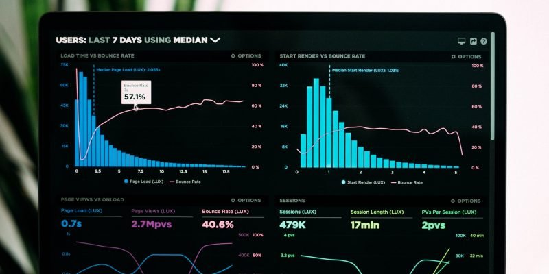
The loading speed of your website is very important. When you deploy your website, it is one of the first things you should be mindful of.
If your website makes users wait an inconvenient amount of time before giving them what they came here for, your website is doing it wrong.
Do not give the users any incentive or window to jump back and go to some other website. Speed is related to the development part of your website, and any issues pertaining to it will be handled at the technical stage.
It’s always optimal to keep things lightweight and optimise speed according to the set standards.
Similarly, how long it takes your users to go to some other portion of your website is a good consideration.
To make moving around your website faster, Fitts’s law is a good evaluation criteria that can guide you to design your website in a way that saves the time of users on your website.
Where loading speed is concerned, many cutting-edge web development tools aim to provide help by reducing unnecessary weight from the website.
When you are evaluating your website, do keep in mind that you use the best, latest approaches to get the best speed results.

4. Ease-of-Use
How easy users find it to use your website is another important factor to consider. The major goal of website design is to make things easier for users. Depending on the type of website, how this is done varies. There are many factors to consider when it comes to making the right decisions.
Ease of use means that users should have no difficulty understanding and navigating their way through your website while reaching their desired place without any difficulty.
Moreover, it also means that all users, regardless of their level of expertise and knowledge of your niche, should be able to understand your content and find it useful.
One of the latest innovations in terms of ease of use is accessibility in website design.
Making your website accessible to people who are inconvenienced in one way or another has a very positive effect. Every website in this day and age should be accessible to at least some degree. A major example is responsiveness, which means making your website effective for mobile users.
5. UI Design
The user interface is the first thing prospects see. So, of course, a website can’t be properly evaluated without considering the UI design of the website.
In the current age of website design and development, UI and UX have advanced to more than just the technical fields of computer science. UXDs take user psychology into consideration as they create the best strategies for an effective website design.
Monitoring how the user moves through your website, determining the most important parts of your business that can be incorporated into the design, and facilitating users so they reach the right places on your website—all of these are part of UI design.
And for the best possible results, UI and UX developers have done a lot of testing and studying and come up with a bunch of theories, all of which help make website designs better.
The optimisation of UI can’t be done without considering the side effects of design elements on other important factors such as speed and responsiveness. So when you’re evaluating your website’s design, don’t neglect its impact on other factors either.
6. Interaction
Interaction is key in the age of Web 3.0. Your website should have ample opportunities for users to interact with it. Whether it is personalisation or using some tools on your website, all of these make up important criteria for a good website.
That said, leaving too much to the user isn’t exactly helpful. For example, using the ancient practice of leaving the users to type out into fields is quite arduous. Instead, things can be made much easier with prompts and presets.
On that note, a new technology that is now becoming popular is using AI chatbots on websites to answer user queries. It’s an excellent way to improve interaction.
Interaction determines how involved a user is with your website. It’s a positive factor for websites if users look around and interact with various widgets or simply use a tool on the website.
Interaction on websites is determined by both the functional aspects and the UI design.
7. Functionality
Functionality means the objective your website is supposed to perform. When we talk about functionality, we’re simply asking whether a website is fulfilling the purpose it was supposed to.
This is the whole reason your website was made. To put things in a better perspective, consider a location-finding website. The website will take some data from you, possibly try to access your location as well, and then, based on your data, give you a location.
You’ll naturally expect the location finder to be able to determine invalid coordinates. Similarly, you’ll expect it to pinpoint your target location with at least 90% accuracy. And of course, a location finder should be able to find a location anywhere in the world and not just be limited to a certain area.
This isn’t expecting much. This is just the right amount of functional requirements. After all, a location finder should have all these basic functions to be qualified as a proper location finder.

Similarly, an online photo editing tool should have all the functionalities pertaining to modern photo editing.
The gist of all this is that whatever your website is, it should have the bare minimum requirements fulfilled when it comes to functionality. If it fails to fulfil them, then it fails to be a good website.
8. Originality
Originality might sound far-fetched, considering you see hundreds of websites working on similar models all the time. Nevertheless, it makes up a fundamental part of the evaluation criteria for websites.
Before we go on, let us set this straight: it is impossible to be plagiarism-free. As they say, existing is plagiarism. There’s no doubt about it. But when it comes to the online world, the fact is all the more true.
This is why we need copyright laws in the first place.
That said, originality is still crucial for websites. The way to achieve it is by simply doing things yourself. Hopping onto other people’s content and copying it to your website shatters originality. While the facts may be the same, opinions can vary. And where opinions are the same, languages can vary. And at the very least, words can vary if nothing else varies.
By originality, we don’t mean you should completely overthrow the layout and structure of a website. In fact, that might not be a good idea. Sticking to certain standards is always nice. But what you put on it has to come out of your own mind.
9. Intent
The intent of your website determines who it caters to. And on that note, it also says what your website’s purpose is.
First of all, see if you’re mixing up niches. It’s alright to explore sub-niches, but don’t stray too far off. For example, does your pet website talk about wild animals and dinosaurs? It sounds interesting to us, but your users will probably want to see more domesticated content.
On another note, and this is just as important, does your commercial website sell stuff? How do you really set up what your website is supposed to be for?
Let’s consider a website called BuySweetPotatoes.com. Quite the commercial name. Users won’t be expecting music on this site. Brand names make things different. For instance, once upon a time, people might have thought Apple sold apples. Must have been quite a surprise.
In conclusion, your website should have a clear intent. You don’t have to worry too much about the name as long as it isn’t completely misleading. What you need to look out for is that your website is consistent and doesn’t get lost with any other mixed intents.
10. Relevance
Relevance means that your website has to be useful. You may have a stellar website set up, but it may not provide users with much of a benefit.
For instance, you set up an e-commerce website with all the right things and make a perfect online store. But the product you’re selling is floppy discs.
It isn’t even a good joke.
Something that has gone obsolete isn’t going to do you any good. And a website that isn’t up-to-date isn’t useful to anyone. All the big websites that have been around since the 90s revamped themselves over time to stay relevant.
It’s all about not doing the wrong things at the wrong time. Like setting up a sauna in Africa or talking about the benefits of milk for lactose-intolerant people. This may be a bit too far-fetched.
In website terms, if Wikipedia started putting Tic Tac Toe on every page just to increase user interaction, that would be utter nonsense. Staying relevant means staying up-to-date with the times and being coherent with your niche.
Conclusion
Depending on the type of website, you’ll need to take a deep dive and evaluate every single element. We’ve tried to give you a general idea of all the most important aspects that make up a website.
But don’t forget that while you’re optimising for one factor, there might be something you end up missing completely. A good website keeps everything in check and creates an effective balance.


