Responsive websites are the pinnacle of mobile web development, and it is hard to imagine a good website that doesn’t run on all screen sizes.
Responsive websites have smooth rendering across all devices and are adjustable according to the size of your screen. You can simply think of them as websites that run effectively on mobile devices.
In terms of business and brand image as well as for personal websites, responsive designs prove to be very advantageous. In the current age of the web, responsiveness has become a standard for websites, without which they can’t hope to compete with anyone or succeed on the Internet.
Here we’ve curated a list of 10 advantages of a responsive website design. So without further ado, let’s get into it.

1. Increase Your Reach
Responsive websites allow you to reach more people. 59% of people primarily use mobile phones to access the Internet; 39% use desktops and laptops; and only 2% use tablet devices. What this means is that if your website is only catered to desktops and isn’t responsive, you’re already missing out on more than half of Internet traffic.
The biggest advantage of responsive websites is that they can be accessed anywhere and anytime and still provide the same experience as a user might have on a desktop. The world is too fast for people to open up their big screens just so they can look at your beautiful website. If you bring the same experience to mobile devices that are much closer to people, you are taking a huge step towards expanding your network horizons.
2. Faster Loading Speeds
Responsive websites are built with a mobile-first approach. In simple terms, the mobile-first approach means that when developers start building a website, they start by building it for small devices. This means they start by optimising the website for mobiles, before moving on to tablets, and finally towards laptops and desktops.
This approach is contrary to downgrading the desktop website to a mobile level, which takes out some magic and doesn’t exactly provide the same experience. In the case of the mobile-first approach, since websites are optimised for every device, they have fast loading speeds on every device.
Remember that mobile devices don’t have the same power as your desktop, so a website that may load instantly on your computer won’t load as quickly on a mobile device. And if your website isn’t responsive, this delay would be considerably longer.
3. SEO Ranking Factor
Responsive websites are a ranking factor for search engines. So if your website isn’t responsive, you’re going to have a rough time with your competitors.
Over the years, search engines have prioritised mobile users in many ways. Before responsive web design, AMPs, or Accelerated Mobile Pages, were in fashion. AMPs were introduced by Google itself, and their aim was to make the mobile experience better for users.
AMPs are now no longer deemed important, and Google itself doesn’t seem to care much about them. Instead, responsive web design is the new preferred way of making websites more accessible to mobile users.
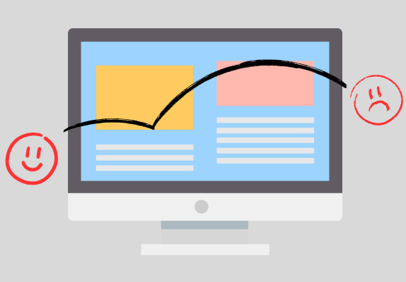
4. Improved User Experience
Responsive websites have a couple of features that contribute to an improved user experience on the site.
First, responsive websites are adjusted according to screen size. Problems like overflow and having to scroll sideways aren’t an issue with responsive websites. The term for it is reflowing content, which forces the browser to measure the dimensions of the device where the website is being displayed.
Similarly, relative sizing means adjusting the size of every element relative to the screen size. On responsive websites, some elements can be hidden to ensure the page looks good on mobile screens. Since desktops have more space, they can incorporate more elements per section. It isn’t true for mobiles.
All these optimisations render a website very original for the screen it is running on. From improved loading speed to resizing images and adding flexibility to the website, all these factors contribute to a positive user experience.
5. Higher Conversions
This one’s easy to see. A good user experience means prospects leave happy. The chances of their conversions are much higher. If users have a bad experience on your site, they will likely not come back. On the other hand, your website could become a go-to site for them if you maximise the user experience by making it responsive.
Another thing to mention here is that since responsive websites are seen positively by search engines, your site is likely to find a good place in rankings, which means users would want to trust you as well. And since you’re already reaching more users with a responsive website, your conversion rate will multiply. So all these factors will contribute to your website being more visible, credible, and likely to earn more traffic and conversions.
6. Lower Bounce Rates
Higher conversion rates directly imply lower bounce rates. Bouncing is also called pogo sticking. You may have heard the term being thrown around. Pogo sticking is when a user visits your website, sees it, doesn’t like it, or realises it isn’t what he was looking for, and leaves immediately.
Generally, pogo sticking is a bad performance signal, and search engines may use it as an indication that your website isn’t worth it. So keeping the bounce rates as low as possible is the way to go.
If a mobile user clicks on your website and realises it isn’t optimised for their device, they’ll likely hop back and go to some other site. That isn’t good for your website’s performance, and you wouldn’t prefer it. Even if your website has great content, if it is hard to see or navigate through, users are likely to go to whatever the next option is.
Similarly, if your website takes too long to load, users won’t wait around. They’ll prefer something that answers their queries faster.
7. Low-Cost Mobile Development
As we mentioned before, responsive websites are made with a mobile-first approach that optimises the website step by step for every device. In contrast, other tactics, such as AMPs, require a completely different set of development, which can make the entire process inefficient.
In the case of responsive website design, relative sizing ensures that every time a new screen size or mobile model comes out, you won’t have to go back and ensure your website is optimised for it. And if it turns out that your website isn’t doing well on that particular screen, you might have to optimise it more.
This can make mobile development quite an ordeal and cost you too much, not just in terms of money but also time. Responsive websites solve that problem and make website design economical for you.
8. More Traffic
If your website is able to reach more people, is preferred by search engines, and is known for a good user experience, why wouldn’t it drive traffic towards you?
Responsive websites are becoming an essential tool that you should incorporate into your design and development process. They are very effective in terms of driving traffic and the cost of implementation.
Since responsive websites eliminate mobile usability issues, most web developers wouldn’t compromise on them.
9. Cutting-Edge Technique
Responsive websites are a state-of-the-art tool. They are going to stay relevant in the future too. So incorporating them into your development process is good foresight.
For the past year, seeing the decline of AMPs, many websites have reported issues with search engine rankings. The need for AMPs was eliminated simply because almost all websites are now responsive.
And while AMPs had been around since 2015 and had their time in the limelight, they are now in their downfall, and while some websites don’t feel like taking them off, if you are building a new website, you should definitely aim to make it responsive.
10. Consistent Interface
Instead of creating a separate mobile site and interface, you can stick to the same one you have on your desktop, which gives your website a unique identity. Responsive websites are consistent, coherent with a design theme, and hence have a better UI.
Since you won’t have to specifically design your website for every device and screen size, your one interface will run everywhere and adjust itself automatically. This makes responsive websites very good, as they help you build a brand image and let you incorporate your own brand-specific elements into the website.

Takeaway
There are many advantages of responsive websites that make them worth it. Especially in this day and age, responsive designs are considered a must.
If you’re getting a website, make sure you aren’t using any outdated technology for optimising your website for mobile devices. Responsive websites are not only seen positively by search engines but also have a positive effect on users.